As I’m sitting at my favorite café watching everyone, it seems some people never consider color coordination when getting dressed for the day. My guess is that most of us simply pick out clothing in colors we like without considering how to match up the right colors.
Well, if you really want to turn heads and stand out in a crowd, you need to learn how to successfully incorporate color into your wardrobe. Luckily, it isn’t terribly difficult to learn and you’ll have us guiding you along the way.
Why Color is Important in Men’s Fashion
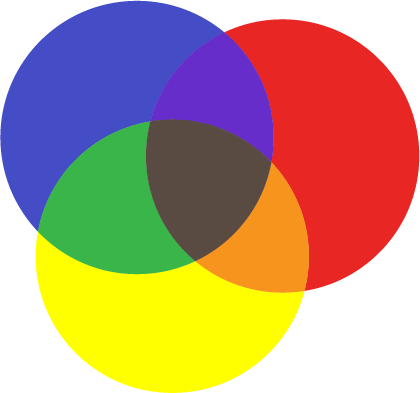
The graphic below shows how you can combine three primary colors: red, yellow and blue, to create 3 new colors; orange, violet and green.
Similar to artwork, color plays a very important part in fashion. Every color evokes emotional responses. For example, purple has long been associated with royalty, while red is associated with passion. Red may make you feel more courageous or aggressive when you wear it.
On the other hand, neutrals like brown or grey convey reliability, pragmatism and conservatism. Likewise, black—one of the most powerful colors—is authoritative and formal. Understandably, as with art, most of us have no real idea why something looks good, just that it does.
The color wheel is a way to represent the relationships between different colors.
Think back to art class in elementary school where you would mix two different paints together to create a new third color. That’s exactly how all the colors on the color wheel are created: by mixing different pairs of colors together.
With enough different color mixing combinations, you create a complete wheel of color just by starting with those three initial colors (as you will see in the following graphics).
(Re-) Introducing the Color Wheel

Let’s revisit the color wheel. You probably remember learning about this in elementary school when you were finger painting. The color wheel can help us understand the relationships between different colors. The primary colors-red, yellow and blue-start everything off.
Red, yellow, and blue are primary because no other colors can combine to make them. However, mixing these colors will result in our three secondary colors: green, orange, and violet (purple). You can then mix primary and secondary colors to form tertiary colors.
For example:
Red (primary) + Blue (primary) = Violet (secondary)
Blue (primary) + Yellow (primary) = Green (secondary)
Blue (primary) + Green (secondary) = Blue Green (tertiary)
Red (primary) + Orange (secondary) = Red Orange (tertiary)
As you can probably guess, the color combinations and results are endless. The mixing of colors can go on and on, but for style’s sake, we don’t need to go much farther.

Color Positions
The positions of the colors show how they relate to one another. Colors that are next to each other on the wheel are called associated or analogous colors. These colors are low-contrast and pairing them in your ensemble will give you a monochromatic effect. For example, blue is analogous to violet.
Complementary colors are directly opposite each other on the wheel. These colors, on the other hand, are very high-contrast. When used in their regular hues (we will cover this term shortly), these colors can be visually jarring. Examples include blue and orange or violet and yellow.
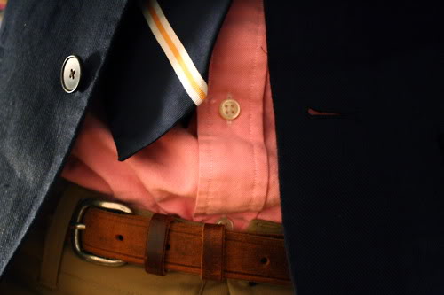
This blue suit with orange tie and pocket square is a great example of complementary color combinations. You can see how bold and exciting complementary pairings can be. However, it’s important to be careful and not use too much of a complementary color or else the outfit can be too overwhelming to look at!

Split complementary colors include two complementary colors and one of their associated colors. A simple example of this match would be yellow, violet, and yellow-orange. Again, hues play a big role in wearing these bold colors together.
Color Terminology
There are a few other terms associated with color that are important to know when constructing an outfit. Before we define these terms, it is important to know that colors are either warm or cool. Each one has a temperature as such. Warm colors include red, yellow, and orange, while cool colors include blue, green, and violet.
Additionally, every color has varying degrees of warmth and coolness within itself. Interestingly, warm colors seem closer while cool colors feel farther away to or from the observer. Color temperature will matter when it comes to individual skin tones, and we will cover that later.
For now, keep the following color-related terms in mind:
Hue: The purest form of a color on the wheel including primary, secondary, tertiary, etc. colors.
Tint: A color tint is created when white is added to a hue. This makes the color lighter.
Shade: Similarly, shade is created when black is added to a hue. This makes the color darker.
Tone: Adding grey to a hue will create tones. Depending on the hue and shade of grey used, the new hue will be darker or lighter than the original.
Maintaining Balance
You generally want to work colors into your outfits strategically. You can’t just pick two complimentary colors and use one for your pants and one for your shirt. The outfit will be too jarring and off-putting.
A good rule of thumb is to separate the top and bottom of your outfit into dark and light color. For example, you might wear a lighter shade of color on the top of your outfit (shirt, blazer, coat, etc.) and a darker shade of color on the bottom (pants, shorts).
Skin Tones and Color Combinations

You can use your personal skin tones to help determine the best colors for you. Believe it or not, colors can actually clash with your natural skin color, as is evident when you try on a gorgeous royal blue shirt-for example-and realize that you look quite pale and ghostly.
Many people see skin color as a single shade when there can be multiple undertones. Some skin colors include blues, greens, yellows, pinks, and reds. In general, lighter skin tones often have blue, red, and pink undertones, while darker skin tones have gold, yellow, and green undertones.
The best colors for darker skin tones include warmer colors, while the best colors for lighter skin are generally cooler colors. This is just a generalization and can vary from person to person. It is best to determine your skin’s undertones. Then you can use the color wheel to help determine a color palette that is suitable for you.
Most people can also wear clothing that matches their eye color. This will make your eyes stand out more than any other feature.
Warm Colors vs. Cool Colors
As briefly mentioned, warmer colors complement darker skin tones and cooler colors complement lighter skin tones. If you have ever noticed that you love a certain color, but can never seem to find clothing in that shade that looks good on you, this is probably why.
What are warm and cool colors? It’s simple, really. Warmer colors are any colors with red, yellow and orange hues. Cool colors have blue, green and purple hues. This is the general consensus though both warm and cool colors have varying levels of “temperatures,” so to say.
For example, by mixing a solid purple hue with more red, you will create a “warmer” cool color. In this same sense, you can “cool” warmer colors down, as well. The following graphic gives a few examples of color temperatures.

Tips for Using Color in Your Wardrobe
We are going to leave you with some tips to help get you started on your journey to using color to enhance your personal style. It may take some trial and error, but the concept of using colors is not difficult. You also have the option of checking out the KINOWEAR Bible for additional tips and assistance.
- Print out the color wheel and truly understand the locations and relationships between colors.
- Analogous colors are generally harmonious and easy-on-they-eyes.
- Bold looks can be created by using complementary colors or split-complementary colors, but can be visually jarring when paired as main pieces of your ensemble.
- Neutrals are usually safe and work with all skin tones. Neutrals include black, brown, grey, and navy blue.
- As a general rule, keep the colors in your outfit to no more than three. More than three colors can feel busy and overwhelming to the observer.
- Learn your skin tone and how to match colors that complement your natural undertones.
- Keep things balanced. Do not pick two complementary colors and use one for your pants and one for your shirt. Instead, incorporate these colors into a shirt and maybe a pocket scarf in your blazer.
- A good rule-of-thumb is to keep lighter shades on the inside of your ensemble with darker shades on the outside.

Again, learning what colors work for you and how to use them is a journey. You may find yourself loving certain colors, but hating the way they look on you. That’s okay, move on to a color that is better suited for your skin tones.
You’re certain to turn heads when correctly incorporating color into your wardrobe. Good luck and let us know how it all goes!
Kinowear Starter Pack
Get this free guide, and look better tomorrow!