
It’s time to regain some order when it comes to colors. The situation has gotten ridiculous, and I’m going to tell you why. And also how to bring your color skills up to this standard:
You know that more and more men are worrying about dressing in the right colors. And people often ask me during a makeover, “Ben, which colors should I wear?”.
The problem is that you hear anything and everything on the subject of colors. The majority of makeover agencies have made it the focus of their presentations, citing a whole range of related tools: seasonal analysis, drape testing, even “chromopsychology” (no, seriously)…
I’m going to make myself very clear: I think these tools are USELESS.
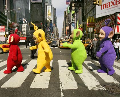
These men have been condemned to a life of dressing in red, yellow, green, and purple, respectively, by Saint Chromopsychology… (Bonus question: which one has come off the worst?)
Color theories : it feels like something’s missing
To start with, telling a guy who doesn’t know anything about colors to wear blue isn’t helpful, because there’s blue and there’s blue. Just as there are cheap-looking materials, there are equally thousands of really cheap-looking colors, often linked to the quality of the material (but that’s another story). And there are some beautiful shades that don’t appear on the color chart or the drapes used by makeover agencies. That’s the problem.
Advice of the “you’re more Fall than Winter, so you should dress in warmer colors, they’ll add warmth to your complexion and complement your personality” kind is hardly comprehensible to a guy for whom H&M on a Saturday afternoon is his only fashion reference.
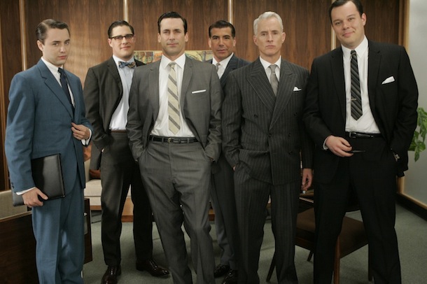
Do you really think that Don hesitates over what to wear in the morning? (He should, however, pay more attention to the length of his tie…)
In all honestly, even I don’t really know how to interpret this kind of advice, and the method behind it, as well as becoming more and more vague, does absolutely nothing to help you get your bearings in a shop and construct your style from pieces that suit you.
The advice that I like to give is to look at as much high-end men’s clothing as possible so that you get used to picking out attractive colors (without necessarily buying anything at first). Then have a look around an H&M or an X afterwards. You’ll see where I’m coming from. It’s really important to develop an eye for colors. Going to art exhibitions and admiring a country view are also good habits to get into (even if they don’t fall strictly within the genre of this blog).
Having noticed that the best pieces of men’s clothing often come in subdued colors (not all the time, but often), Kinowear’s team and I offer a few very simple rules during our men’s makeovers.
- Base your outfit above all around contrast: the level of contrast between the items you’re wearing should be about the same as the level of contrast between your skin and your hair.
- Pick up on your natural colorings (the color of your eyes, cheeks, hair) by wearing accessories in those tones.
- Wear mainly neutral colors (blue, brown, grey, a bit of black and white).
- Don’t forget the importance of cut: I’m convinced that a guy who wore solely black and white but well-cut clothes would have more style than someone who dressed according to the four seasons color theory)…
- … or the importance of materials: understated colors require high-quality materials. It’s up to you to find them.
 A laid-back approach to color.
Last thing: don’t get too worked up over colors. There’s very little risk of getting it really wrong. As I repeat tirelessly, focus your efforts on finding excellents cuts and materials, especially when it comes to your basics, which you can later team with pieces in bolder colors.
Never go naked again !
Read our Best-Of our take the Crash Course to start working on rock-solid foundations.
But you have to know, that are our best advice are in The Kinowear Bible. Included 100+ HD photos of looks that you can easily replicate. Click here.

Which colors should I wear?
Blue, brown, gray: the three pillar colors
It’s a bit of a shame, but we have less freedom than women when it comes to the colors we can wear. Generally speaking, a guy’s wardrobe should be based on three colors: blue, brown, and gray (and any tone that’s a combination of these colors, like blue-gray, taupe and camel).
Of course, you can add touches of other colors to your outfits, but I defy you to dress head to toe in purple and not look like a Power Rangers fan… Well, alright, it’s possible. But I want this post to be accessible to as many people as possible, so, for now, let’s focus on the basics. (N.B. If you’re the purple Power Ranger and you’re reading this post, please ignore this paragraph.)
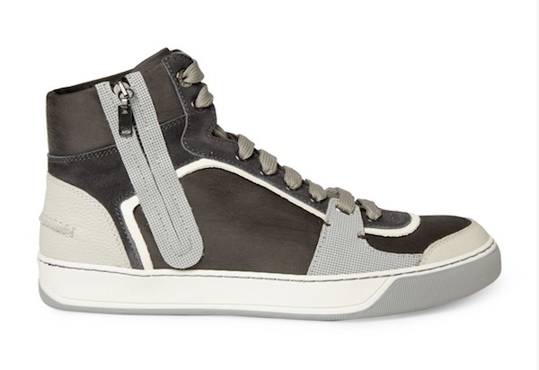
Gray, brown, beige – contrary to popular belief, these sneakers are easier to wear than black ones.
Abuse these three pillar colors, especially if you’re a style beginner. Gray is the easiest of these colors to wear, and, contrary to the stereotype, isn’t a “sad” color… Play with original cuts and materials, or use gray to balance out other pieces in bolder tones, like bordeaux, khaki, violet, clear blue, orange, etc.
If you select all of your clothes in these three colors, you’ll never have to worry about clashes when it comes to putting together your outfit!
Tip: don’t overlook pastel shades, especially in summer. Acne, APC or Saturday Surf NYC and more generally, Scandinavian brands, offer some nice pieces.

We approve of gray as a base color for your outfits. So does he.
The colors you wear too much of
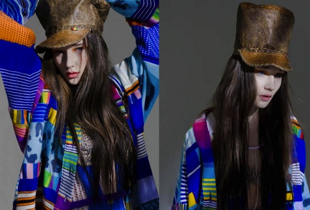
Certain colors should clearly be used in moderation. I’m thinking particularly of bold shades of primary and secondary colors, like the colors of the poster paints you used in kindergarten. These shades are quite simply too garish and lacking in subtlety. You can use them in small doses, but more than one item per outfit in a tone like this is probably already too much.
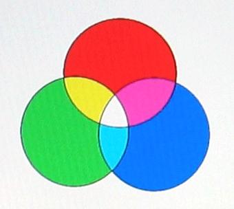
The three primary colors mix to form three secondary colors. Nice for a Mother’s Day card, but garish for an adult’s wardrobe.
The case of black and white
Let’s debunk the myth right now. Black and white are not easy colors to wear. And they don’t suit everyone. Quite the opposite, these colors are tricky to wear well, because they’re at the two extremes of the color spectrum. Often, if the other colors you wear with your black piece(s) aren’t dark enough, all people will see is the black piece(s), which will dominate the outfit. The same goes for wearing colors that aren’t light enough with your white piece(s).
What’s more, these aren’t practical colors. White becomes gray through washing and general wear, and black fades, unless you buy really high-end clothes where everything is done so that the dye holds.
So use them in moderation, and if you do buy black, do so purposefully (i.e. with a specific idea in mind), not by default. For the easy option, go for gray.
Ben and Gill wrote a response to an email from one of our readers on the subject of colors, where they talked about how to wear black. It repeats some of what has been said in this post and the previous one
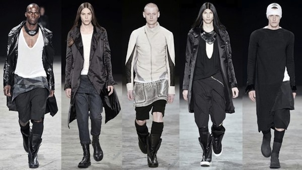
The Rick Owens catwalk shows will give you good ideas if you want to wear black and white. Notice how the colors of the models’ hair/skin/hat have been repeated in their respective outfits. It’s subtle but it’s one of the details that’s key to making these looks work.
So stop worrying about colors and start thinking about contrast!
Now that you no longer need to stress out about wearing the right colors (because, at the end of the day, you can always just stick to blues, browns, and grays), we come to the second key element of coordinating colors: contrast. Don’t skip this part, because it’s the most important one!
If you only retain one piece of information from this post, it should be this sentence:
The level of contrast between the items you’re wearing should be the same as the level of contrast between your skin and your hair.
A hangover from our hunter-gatherer ancestors, the eye is always drawn to contrasts, to the part that sticks out from the rest. As a consequence, an observer’s eyes will always be drawn to the most contrasting part of your outfit. The objective is of course to direct attention towards your face with an outfit that has just the right dose of character.
The problem is that if you have fair skin and light hair, but you wear an outfit with strongly contrasting colors, people won’t see your face.
Conversely, if you have fair skin and dark hair, but your outfit is lacking contrast, your clothes will look a bit like pyjamas, as all the attention will be on your face.
Photo illustrations (I’ve put the photos in black and white to so that you can see the contrasts separately from the colors themselves):
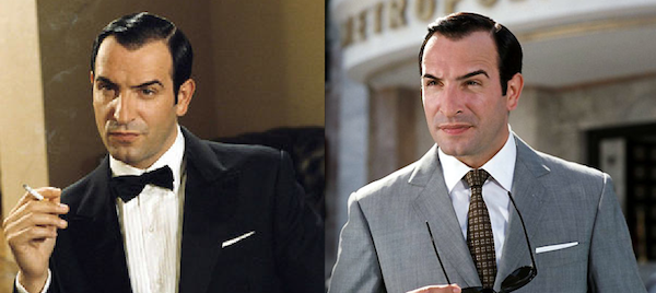
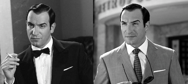
-> Strong skin/hair contrast: Jean Dujardin.
Left: the black/white contrast is just a touch too strong given Jean’s tanned skin tone.
Right: the gray suit works better because it contrasts less with the white shirt. The outfit is more balanced.
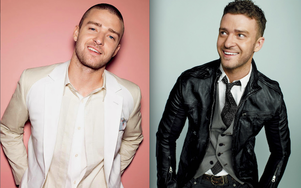
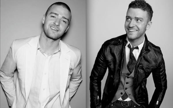
-> Intermediate skin/hair contrast: Justin Timberlake.
Left: little contrast in the outfit but contrast on the face = pyjama effect.
Right: the outfit contains more contrast, the result is more balanced.
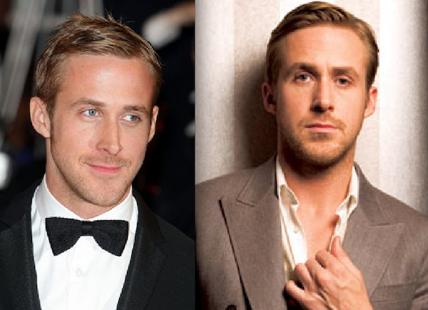
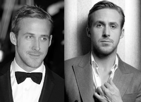
-> Weak skin/hair contrast: Ryan Gosling
Left: lots of contrast in the outfit. The black bowtie and white shirt combo steals the limelight from Ryan’s face.
Right: the appropriate level of contrast to draw attention to his face.
Which colours should I wear if I’m Black, Asian, Hispanic…?
This is a question that guys often ask, and it’s true that it’s a bit of a special case.
If you’re multiracial (like Grant Harris at Image Granted) the usual rules apply: contrast between clothes = contrast between skin and hair. The same goes if you’re Black, Asian or Hispanic and there’s a contrast between the color of your skin and hair.
For inspiration on black man style check also this two blogs Sabir features a lot of looks of his own at Men’s Style Pro whereas Glen Antoine Palmer at Gentlemen Standard a proposes a sophisticated perspective on how men of color are portrayed.
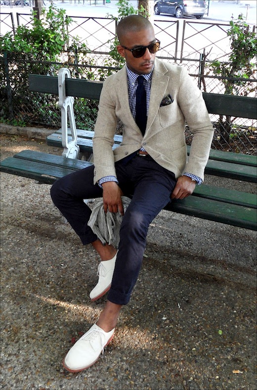
A lightly contrasting outfit (except for the shoes, the objective being to shake up the ensemble with something that cuts through the rest a bit. N.B. As always, rules can be broken if you know what you’re doing.)
If your skin tone is very dark, you can still go by the same rules, but with more freedom. Just avoid outfits with too strong a contrast. I also think that darker colors will tend to suit you best.
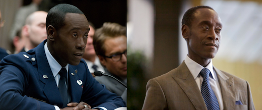
Don Cheadle. A nice palette of colors on the left. The lighter jacket on the right doesn’t look as nice in my opinion.
Also, I don’t know why, but pure shades of primary and other bold colors often work really well with dark skin. So, feel free to experiment! The outfits worn by Congolese Sapeurs are often very appealing (albeit a bit too exuberant for everyday life). These guys often have a real mastery of color.
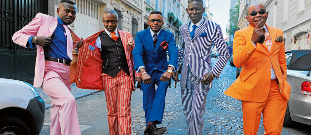
Pink, red, royal blue, orange – not sure that everyone could pull this off…
Repeating colors in my outfit – what do I do about that?
Picking up on colors from one piece in other areas of the same outfit is a technique overused by the fairer sex. They don’t just match their clothes with their accessories, but also their make-up, the color of their eyes, or the highlights in their hair. And it suits them.
Without going quite as far, we can still take something from this repetition of colors:
- Match the color an accessory like a tie or scarf, or an item like a shirt, with the color of your eyes.
- Match the color of an item of clothing with the color of your hair.
- Repeat colors throughout your outfit to bring it together. For example, wearing a scarf with red tones means that you can integrate a pair of bordeaux socks into your ensemble.
These are ideas, not set-in-stone rules. Experiment in front of the mirror with different clothes. The rule about contrast still applies here – it’s a really important one.
J-Crew or Zara’s lookbooks are often a good source of color inspiration (even if the quality of the pieces isn’t always that great).
Your answer in the comments: What are the most difficult colors to use in an outfit ? Pink, yellow ? I’ve hear also heard that green was a probleme sometimes ? Is that right ?
Postscript
If you feel like you’ve gotten the hang of this basic kind of advice, let us know by leaving us a comment. Feel free to send us suggestions for more advanced topics to cover in our posts, too.
Kinowear Starter Pack
Get this free guide, and look better tomorrow!
Hey,
Wanna help me for part 2 ?
It’s simple, tell me, in your opinion what are the most difficult colors to use in an outfit ? Pink, yellow ? I’ve hear also heard that green was a probleme sometimes ? Is that right ?
Green’s easy, especially dark green, goes great with brown. As long as you keep the rest simple you can easily get a way with a bright green oxford or even dark green chinos.
Faded pink t shirts and button ups of a variety of hues look good. Otherwise, pink should be avoided.
As for yellow, I can’t imagine myself pulling of anything more than a mustard yellow.
I actually find black to be the most difficult. You have to be really determined in creating black friendly outfits to make it work. Although cognitively easy to do, can cost a bit if your as on as tight a budget as myself and want almost every piece of clothing you own to work together.
Hi Will,
Thanks a lot for you awesome comment. Guys, there’s a lot of value there!
I 100% agree with your remarks on pink, yellow and green. There is no “no go” but il all depends on how it coordinates with the other pieces of your outfit.
Regarding black, it’s as you pointed out extremely tricky. I don’t wear any.
– One reason being that it’s hard to match with other colors.
– 2nd is that nice black are usually expensive, you want a deep color not some king of superficial dye that ages badly.
– And finally, it’s a sad and very formal color which says it all not reallt what I want to express in my daily life.
PS: Avoid black suits for this 3rd reaon. Go for Navy and grey.
Captain’s Quarters Online Men’s Store: http://www.CaptainsQuartersTC.com – Alex Cannon – Cutter & Buck – Southern Tide – Bills Khakis – Scott Barber – Enro – Hardwick
What about shaved men?
Buy Trousers online
Classicpolo is one of the best brands for exclusive
collections . you can Buy shirts online, buy t-shirts online ,buy formal shirts
online from our store @classicpolos.com. we have widest range of collections.
you can choose the best pants . Buy pants online and Buy trousers online from
the store at best price
Buy pants online
Classicpolo is one of the best brands for exclusive
collections . you can Buy shirts online, buy t-shirts online ,buy formal shirts
online from our store @classicpolos.com. we have widest range of collections.
you can choose the best pants . Buy pants online and Buy trousers online from
the store at best price
Hi Giuseppe, I’m not really sure what you mean. Shaved or bearded man can wear colors the same way, no big deal here.
Hi Nicolas,
I have three pairs of brightly-colored Bonobos pants (electric blue, orange and chartreuse). I love everything about them, from the fit to the color, but where I get lost is what shirts/sweaters to put with them. I tried a simple white shirt with the blue and ended up looking like slimmer version of Homer Simpson. Buying the pants was a big break from what I normally purchase, which are jeans, khakis or cords. Is there a general rule of thumb to looking stylish but not garish?
Hi James.
You made me laugh with that one on Omer Simpson 😀
The best thing to do will be to soften the bright pants with some very neutral colors.
That’s what I explain in the second part of this post: http://www.kinowear.com/how-to-wear-colors-2
For instance give a try to a beige V-neck thin knitwear under a light grey jacket.
Nicolas
No, I meant I have a shaved head, so no contrast to be shown!
Haha! My bad!
Let’s assume there no contrast at all. Like even your eyebrows and lips are very light. In that case it’s not easy to bring eyes towards your face. But it’s definitely doable.
You want the upper part of your outfit to work on light and soft colors. Pastels especially.
This picture of Ryan Gosling says it all. You want to mimick the level of contrast on the right. IE, very low contrast. http://www.kinowear.com/wp-content/uploads/2013/10/ryan-gosling-style1.png
One last thing you can play on that works very well is to make the color of your eyes stand ouf by sublty including it in a tie/scarf/pocket square.
I just published the second part of this article with a focus on face. http://www.kinowear.com/how-to-wear-colors-2
Thanks so much. I’ll give it a try. Looks like I may need to get a few new sweaters and neutral colors.
Thanks a lot! You have been really useful! 🙂
You’re welcome. Let me know how you like these colors fit on you.
My pleasure 🙂
Hi Ripken Holt,
Thanks for your comment, it’s really easy, no big deal. Simply where your purple items one at a time and keep the rest of your outfit in basic colors: beige, gray, navy, white.
Nicolas